Forcom
Objective
Forcom is an AI-powered, all-in-one employee communication and management platform designed specifically for the diverse workforce of the GCC region. As the lead product designer, I created a comprehensive design system spanning the mobile app, admin panel, and company website. The goal was to unify fragmented workforce tools into a single platform that connects, engages, trains, and protects employees across multilingual teams, frontline workers, and distributed operations.
Research & Discovery
I conducted extensive research across multiple GCC industries including construction, healthcare, retail, and manufacturing to understand the pain points of fragmented communication tools. Interviews with HR teams, operations managers, safety officers, and frontline employees revealed common frustrations: scattered data across multiple platforms, language barriers, and difficulty reaching deskless workers. This research informed a mobile-first, multilingual approach that would work seamlessly for both office staff and frontline teams.
Persona Development
I developed distinct personas representing the platform's diverse user base. Faizan, an HR Executive, needs efficient tools to broadcast updates and track training completion across hundreds of employees. Ahmed, a construction site supervisor, requires quick access to safety reporting and team communication in Arabic. Manu Kumar, a frontline retail worker, prefers Hindi and needs straightforward access to payroll updates and training modules. These personas shaped decisions around navigation complexity, information density, and multilingual switching.
Design Language
The visual system balances professional credibility with approachability, reflecting Forcom's position as an enterprise-grade yet user-friendly platform. The colour palette uses blues and white to convey trust and innovation, while maintaining accessibility standards across all touchpoints. Typography was carefully selected for legibility across multiple scripts and screen sizes. The modular design system ensures consistency across the mobile app, web admin panel, and marketing website.
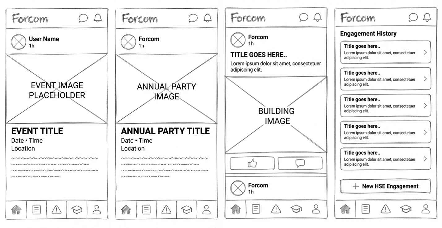
Wireframing & Prototyping
I began with low-fidelity wireframes to establish information architecture for three distinct products: the employee mobile app, the admin dashboard, and the marketing website. Interactive prototypes were tested with target users to validate navigation patterns, especially for complex features like safety reporting workflows and training course creation. The focus was on creating intuitive experiences that felt native to each platform while maintaining visual coherence.
Logo & Brand Identity
The Forcom logo combines geometric precision with forward momentum, symbolizing the platform's role in propelling workforce communication forward. The wordmark works effectively at small sizes for app icons while maintaining impact in larger brand applications. The identity system balances tech-forward energy with the professionalism expected in enterprise software.
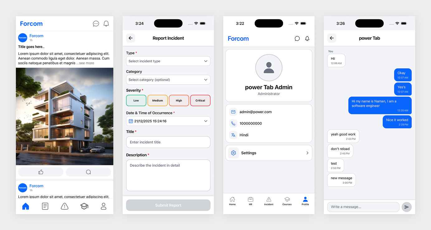
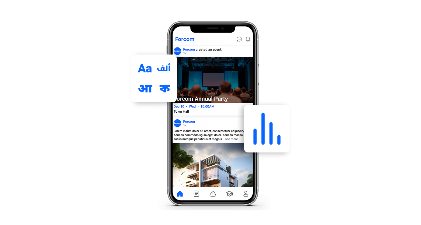
Mobile App UI
The mobile app brings together communication, training, safety, and payroll features in a streamlined interface. Employees can quickly navigate between announcements, submit safety reports with photos, access training courses, and view payslips. Clear visual hierarchy and familiar mobile patterns ensure that both tech-savvy and less experienced users can accomplish tasks efficiently.
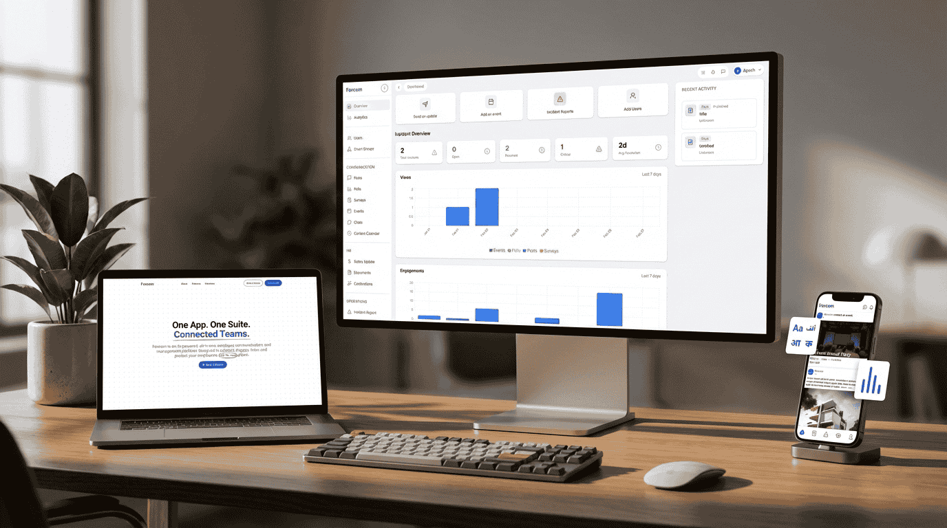
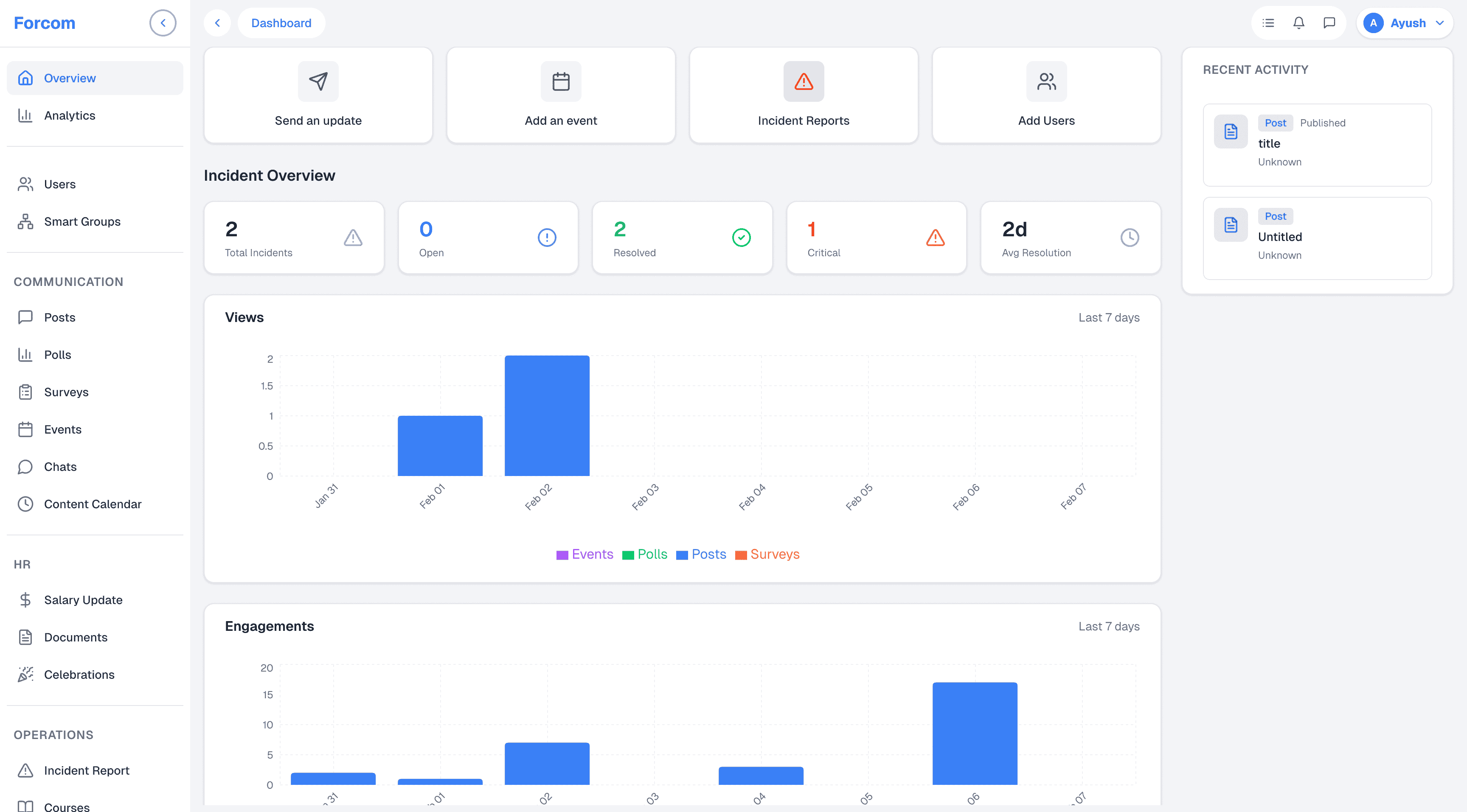
Admin Panel
The web-based admin panel provides comprehensive control over the platform's features. HR teams and managers can create announcements, design training courses, monitor safety incidents, and analyze engagement metrics through an intuitive dashboard. The interface balances powerful functionality with ease of use, featuring data visualizations and bulk management tools.
Typeface
A versatile sans-serif type system supports all the languages including English, Arabic, Hindi, Urdu, and Tagalog. Roboto typeface maintains excellent readability at small sizes on mobile devices while providing sufficient weight variations for clear hierarchy in data-heavy admin interfaces.
Colour System
The colour palette establishes clear functional roles across the platform. Primary blues convey trust and stability, while semantic colours for success, warning, and error states ensure users can quickly understand system feedback. The system maintains accessibility standards and works across light and dark modes.
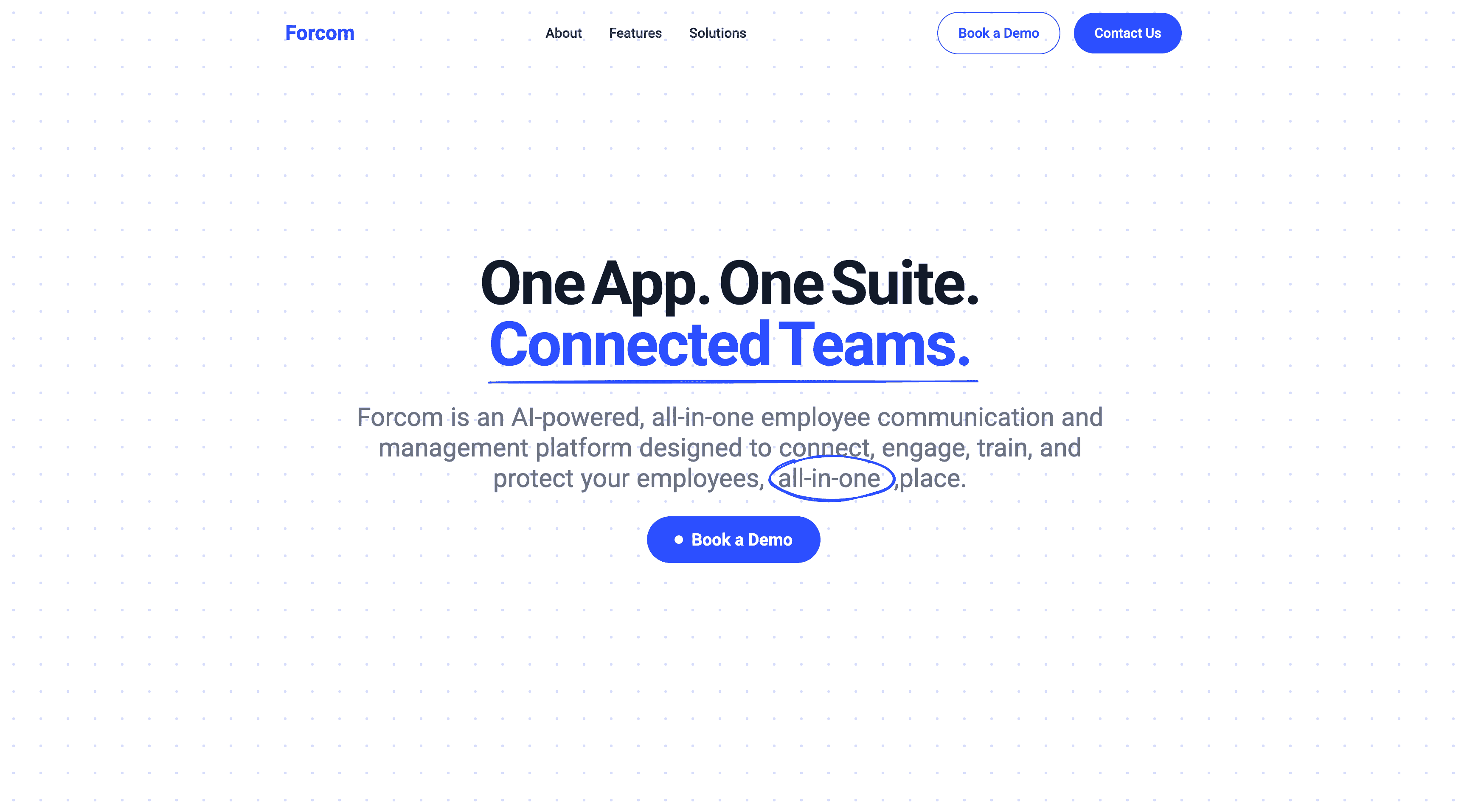
Marketing Website
The company website translates Forcom's product value into a compelling narrative for decision makers. The design emphasizes clarity and conversion, with clear feature explanations, industry specific solutions, and social proof. The responsive design ensures the message resonates across all devices.
Conclusion
Forcom successfully replaces fragmented workforce tools with a unified platform that serves diverse teams across the GCC. By designing the mobile app, admin panel, and website as an integrated system, I created an experience that scales from individual employee interactions to enterprise wide analytics. The multilingual, mobile-first approach ensures every employee from frontline workers to corporate teams can communicate, learn, and contribute to workplace safety in their preferred language.