ERETZ Developers
Objective
ERETZ Developers is a property development company rooted in authenticity, quality, and integrity. As a designer, I was tasked with creating brand identity and website design that would embody their philosophy of "Building Beyond Bricks" a commitment to creating homes that serve as both emotional and financial investments. The goal was to design a digital presence that would reflect the company's premium positioning while connecting with prospective homebuyers and investors on an emotional level.
Research & Discovery
I began by conducting market research into the real estate development sector, analyzing competitor websites and identifying gaps in how developers communicate their value proposition. Stakeholder interviews revealed that ERETZ wanted to differentiate themselves from transactional developers by emphasizing the emotional journey of homeownership. User research with potential buyers showed that trust, transparency, and storytelling were critical factors in their decision making process. This informed a content first approach that would prioritize authenticity over aggressive sales tactics.
Design Strategy
The strategic direction focused on three core pillars: emotional resonance, visual credibility, and user-centered navigation. Rather than leading with property listings, the site architecture was designed to tell the ERETZ story first, building trust before presenting projects. The strategy emphasized large scale imagery, authentic photography of real spaces, and messaging that spoke to the life changing nature of homeownership rather than just square footage and amenities.
Design Language
The visual identity balances sophistication with approachability. A refined colour palette using warm neutrals and earthy tones evokes feelings of home and stability, while maintaining the premium aesthetic expected in real estate. Typography was selected for both elegance and readability, with generous spacing that allows content to breathe. The design system emphasizes whitespace and high-quality imagery to create a sense of luxury without feeling cold or unapproachable.
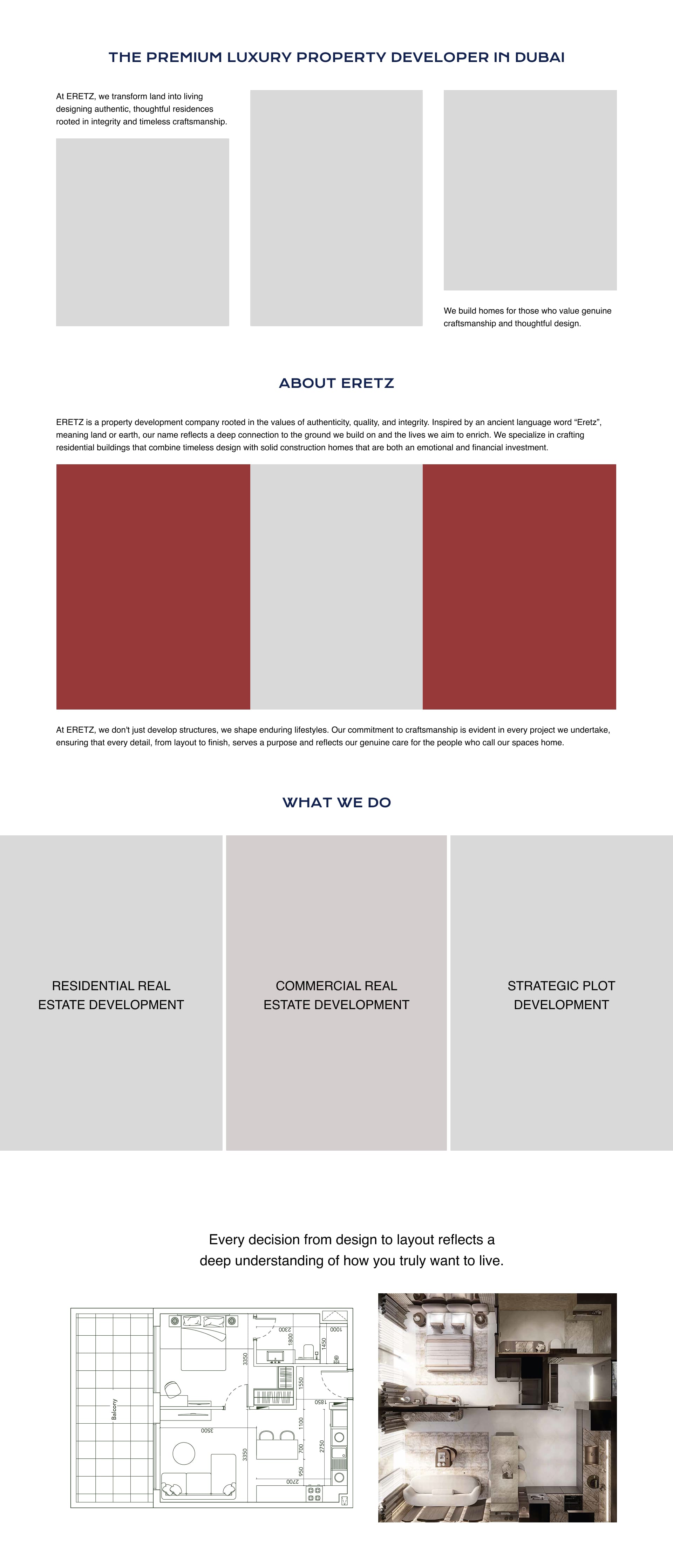
Information Architecture & Wireframing
I developed a streamlined site architecture that guides users through a considered journey, from understanding ERETZ's philosophy, to exploring their approach to development. Low-fidelity wireframes helped establish content hierarchy and user flows, ensuring that critical information was accessible within three clicks while maintaining narrative coherence.
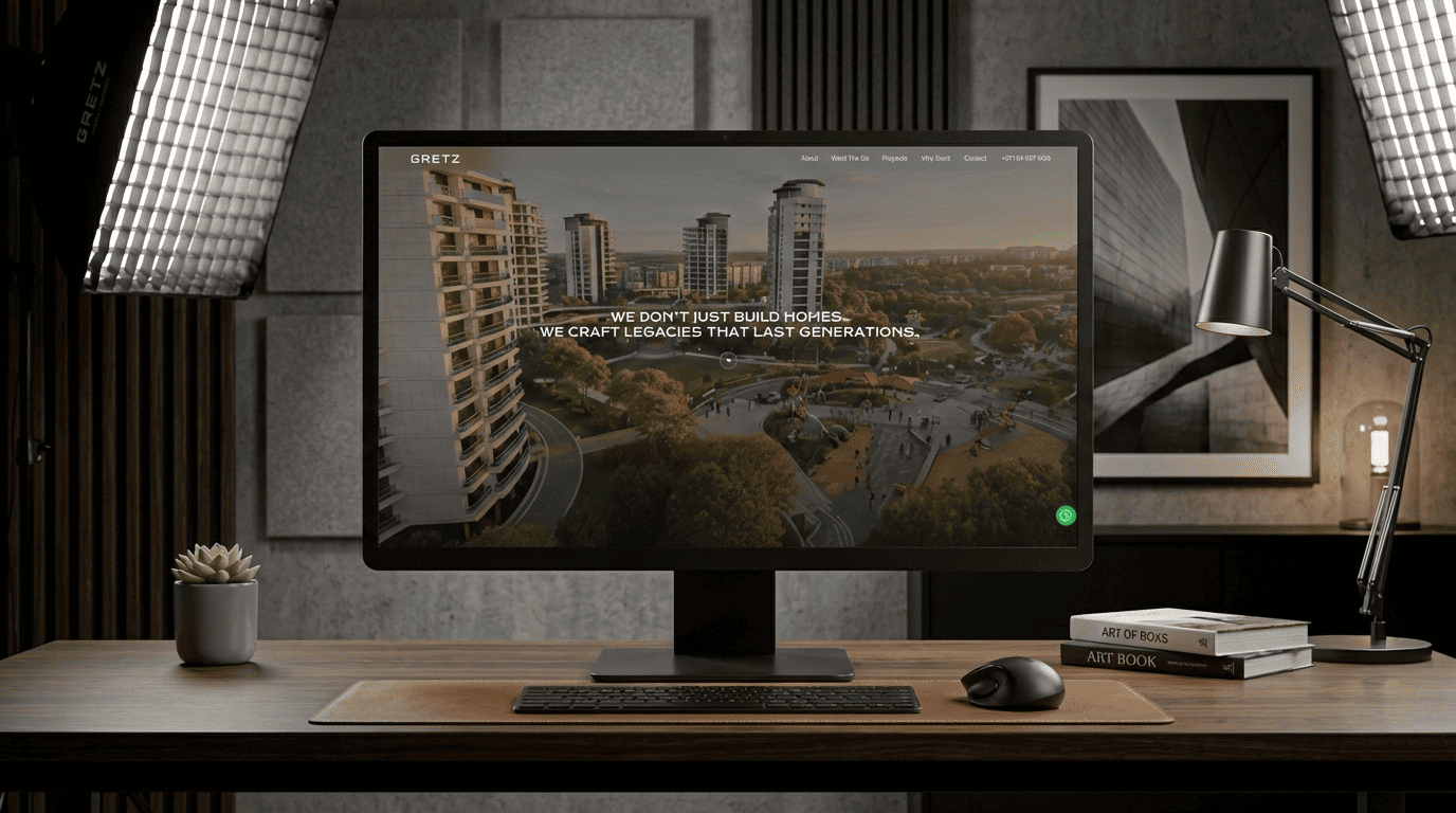
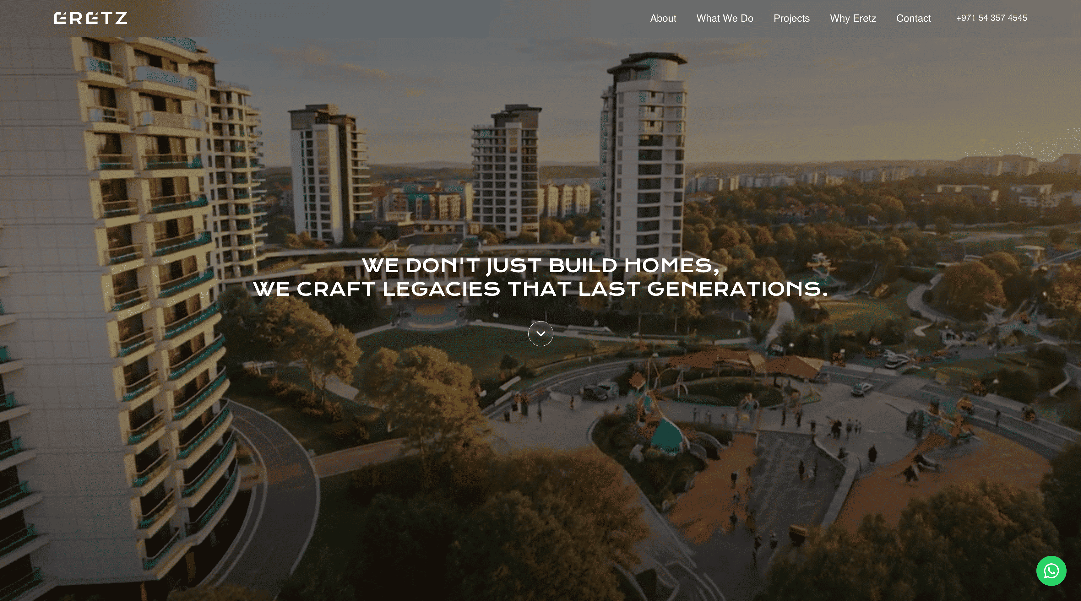
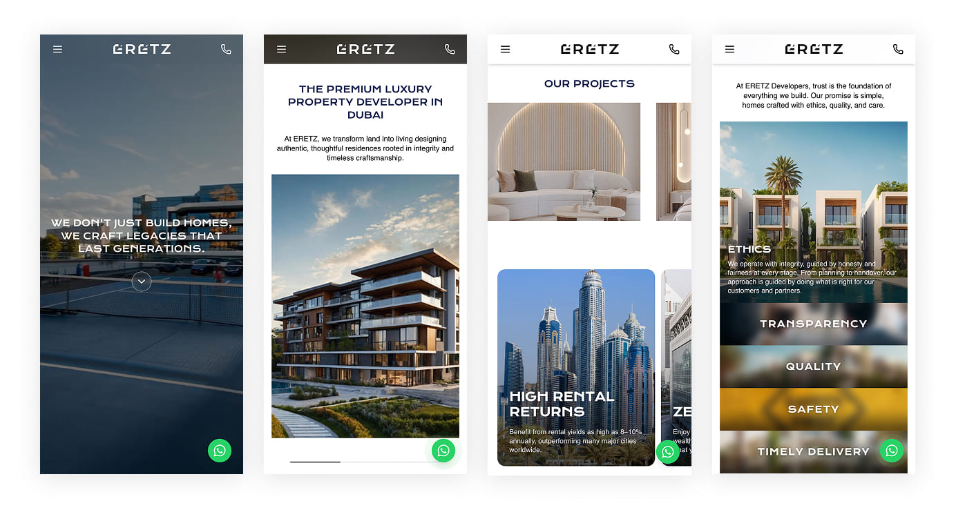
Homepage Design
The homepage immediately establishes ERETZ's distinct positioning featuring compelling lifestyle imagery and minimal text invites users to explore deeper. Strategic calls-to-action guide visitors toward featured projects while secondary navigation provides direct access to key information.
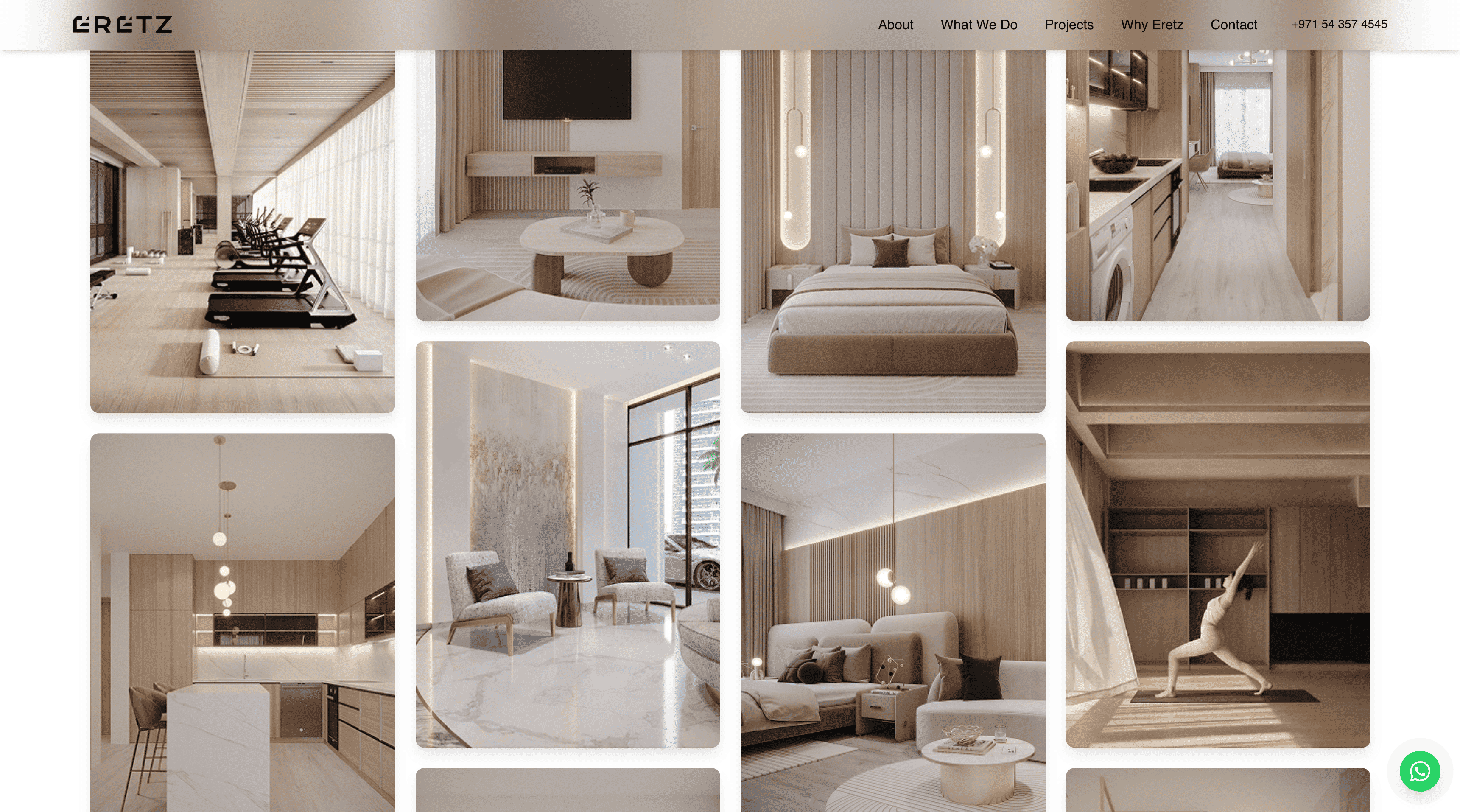
Project Showcase Pages
Individual project pages were designed as immersive experiences that showcase properties through large-format photography, interactive floor plans, and carefully crafted descriptions. Each page balances aspirational imagery with practical information like location, pricing, and availability. Virtual tour integration and downloadable brochures provide multiple ways for prospective buyers to engage with properties.
Responsive Design
Given that many homebuyers research properties on mobile devices, responsive design was paramount. The site adapts seamlessly across desktop, tablet, and mobile, with touch-optimized interfaces for image galleries and floor plan exploration. Mobile navigation was simplified to ensure quick access to contact forms and property listings, recognizing that mobile users often have higher intent to connect.
Typography
The typographic system combines a refined serif for headings—evoking heritage and trustworthiness—with a clean sans-serif for body text that ensures readability across all devices. The type scale is generous, creating comfortable reading experiences and emphasizing the premium positioning. Special attention was paid to line length and spacing to optimize long-form content sections.
Colour Palette
The colour system centers on warm, earthy tones that evoke feelings of home, stability, and natural materials. Primary colours include warm beiges and soft browns, complemented by deeper accent tones for calls-to-action and interactive elements. The palette maintains sufficient contrast for accessibility while creating an inviting, sophisticated atmosphere that aligns with the brand's premium real estate positioning.
Conclusion
The ERETZ Developers website successfully translates the company's "Building Beyond Bricks" philosophy into a digital experience that resonates emotionally with prospective homebuyers. By prioritizing storytelling, authentic imagery, and user-centered design, the site positions ERETZ as a developer that understands homeownership as both a financial investment and a life milestone. The responsive, scalable design system provides a strong foundation for the company's growth while maintaining the premium, human-centered brand identity.